Choosing the Best Fonts and Typography for Tumbler Designs
Introduction
Typography can make or break your tumbler design. Whether you're personalizing with names, quotes, or logos, the font you choose communicates more than just words—it sets the tone. In this blog, we’ll walk you through how to select the best fonts and typography styles that fit your brand, target audience, and tumbler aesthetic.
1. Why Fonts Matter in Tumbler Printing
- Fonts reflect emotion: playful, elegant, modern, or bold
- Good typography ensures readability, especially on curved surfaces
- It helps create a cohesive visual identity across all products
2. Best Font Styles by Use Case
- **Cursive & Script**: Perfect for bridal gifts, name personalization, and elegant themes (e.g., 'Alex Brush', 'Great Vibes')
- **Sans-Serif**: Clean and modern, best for minimalistic or professional tumblers (e.g., 'Montserrat', 'Poppins')
- **Serif**: Classic and traditional—great for literary quotes or teacher-themed tumblers (e.g., 'Playfair Display', 'Merriweather')
- **Bold Display Fonts**: Eye-catching for slogans, sports, or fun themes (e.g., 'Bebas Neue', 'Anton')
3. Font Size and Spacing Tips
- Adjust kerning (space between letters) to avoid cramping
- Use a font size that balances visibility and aesthetic—don’t go too small
- Keep alignment centered or slightly curved depending on tumbler style
4. Combining Fonts Like a Pro
- Pair script fonts with sans-serif to balance elegance and clarity
- Don’t use more than 2–3 fonts per design to avoid clutter
- Use bold fonts for emphasis and lighter fonts for secondary info
5. Avoid These Common Typography Mistakes
- Overusing cursive fonts (especially with long or complicated names)
- Using default fonts without character or brand relevance
- Ignoring line spacing, making the text feel cramped or unbalanced
6. Best Tools for Typography Layouts
- Canva and Adobe Illustrator for fast previews
- Mockup templates with curved text paths for wraparound views
- Font pairing websites like Fontpair.co or Google Fonts for inspiration
7. Add-on Typography Effects
- Raised UV gloss or matte overlays for premium feel
- Foil effect or glitter background to highlight text
- Use shadow or outline strokes to enhance contrast on dark tumblers
Conclusion
Fonts do more than decorate—they communicate. By understanding font psychology and applying smart typography rules, you can turn ordinary tumbler designs into meaningful, memorable pieces your customers will love to hold and show off.
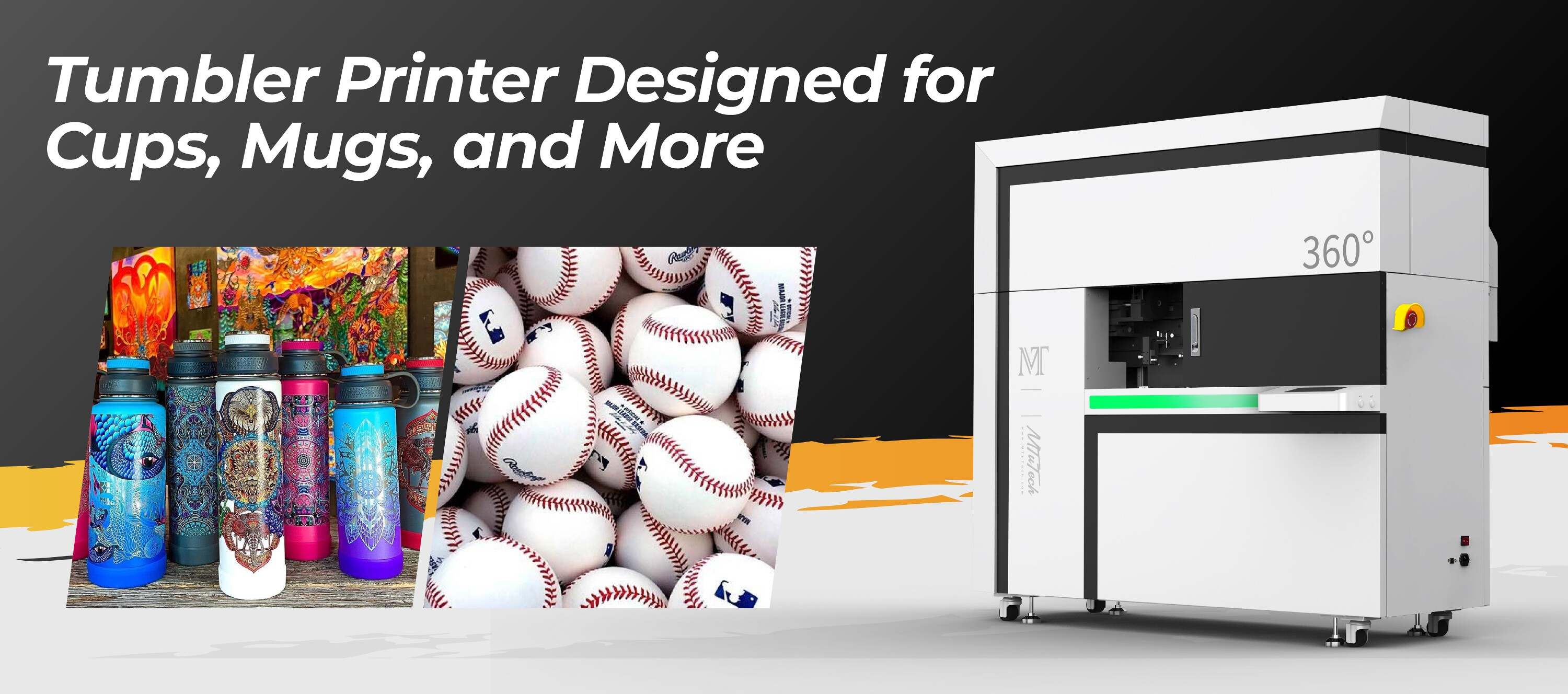
Match your message with flawless typography using our tumbler printer — engineered to deliver sharp, stylish prints with every font you love.

