DTG Printing Color Accuracy: The Complete Artwork Design Guide
In today’s competitive custom apparel market, printing quality can make or break a brand. Customers expect vivid colors, sharp details, and consistent results across every garment they purchase. Direct to Garment (DTG) printing has become one of the most popular methods for producing custom t-shirts, hoodies, and textiles because it allows for full-color designs, complex gradients, and short production runs without expensive setup costs. However, one of the most common challenges designers and printers face is achieving accurate color reproduction.
Color accuracy in DTG printing is not just about making designs look good—it’s about building trust with customers, maintaining brand consistency, reducing waste, and improving profitability. When colors shift, appear dull, or print differently than expected, it leads to reprints, refunds, and dissatisfied customers. For designers, marketers, and print shop owners alike, understanding how to prepare artwork correctly is essential to success.
This comprehensive guide explores everything you need to know about designing artwork for DTG printing with accurate color reproduction. From understanding how DTG printers work to mastering color spaces, fabric choices, file preparation, and workflow optimization, this article provides actionable insights you can use immediately. Whether you’re a beginner designer or an experienced printer looking to improve consistency, this guide will help you elevate your DTG output and produce professional-quality garments every time.
What Is DTG Printing and Why Color Accuracy Matters
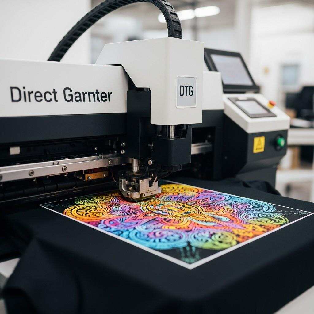
Direct to Garment printing is a digital printing method that uses specialized inkjet technology to apply water-based inks directly onto fabric. Unlike screen printing, which requires separate screens for each color, DTG can print full-color images in a single pass. This makes it ideal for short runs, custom designs, and highly detailed artwork such as photographs, illustrations, and gradients.
However, the flexibility of DTG printing also introduces challenges—especially when it comes to color reproduction. Because the ink is absorbed into the fabric rather than sitting on top like plastisol inks in screen printing, colors can appear different depending on fabric type, garment color, ink saturation, pre-treatment quality, and curing conditions.
Accurate color reproduction in DTG is critical for several reasons:
Customer Satisfaction
Customers expect the printed product to match the design they approved. Even small color shifts can lead to dissatisfaction, complaints, and negative reviews.Brand Consistency
Brands rely on specific colors to represent their identity. Incorrect color output weakens brand recognition and trust.Reduced Waste and Reprints
Color inaccuracies often lead to reprints, wasted garments, ink, and time. Consistency saves money and improves efficiency.Professional Reputation
Reliable color accuracy positions your business as professional and dependable in a crowded marketplace.
Understanding how color works in DTG printing and how to prepare artwork accordingly is the foundation of producing consistently high-quality results.
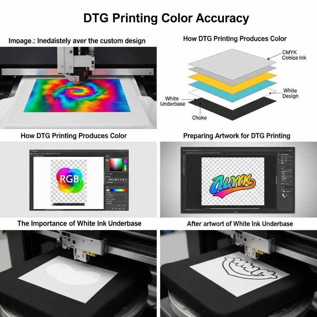
How DTG Printing Produces Color
Before diving into design techniques, it’s important to understand how DTG printers create color on fabric. Unlike traditional printing methods that use spot colors or layered inks, DTG printers operate similarly to high-end inkjet printers.
CMYK and White Ink
DTG printers use CMYK (Cyan, Magenta, Yellow, and Black) inks along with white ink. The white ink plays a crucial role when printing on dark garments. It acts as a base layer that allows colors to appear vibrant and opaque instead of dull or washed out.
Ink Absorption and Fabric Interaction
Unlike paper, fabric absorbs ink deeply into its fibers. This means colors often appear less saturated and slightly darker once cured. The type of fabric, its weave, and its fiber composition significantly affect how ink behaves. Cotton garments typically yield the best results, while polyester and blends can introduce challenges such as ink migration and reduced vibrancy.
Pre-Treatment and Curing
Pre-treatment chemicals are applied to garments before printing, especially dark fabrics, to help white ink adhere properly and prevent bleeding. After printing, garments are cured using heat to set the ink. Both pre-treatment and curing impact final color appearance. Inconsistent application or temperature can cause color shifts, cracking, or fading.
Understanding these fundamentals helps designers make better decisions when preparing artwork and selecting color profiles.
The Role of Color Management in DTG Printing
Color management is the process of controlling how colors are displayed on screens, processed by software, and reproduced by printers. In DTG printing, effective color management ensures that what you see on your monitor closely matches what you get on the garment.
Why Color Management Is Essential
Without proper color management, different devices interpret colors differently. A bright red on your laptop may appear dull or orange on another screen and completely different when printed on fabric. Color management creates a consistent system that aligns design files, displays, and printers.
Core Components of Color Management
Calibrated Display
A calibrated monitor ensures that colors you see while designing are accurate representations of digital values.Color Profiles (ICC Profiles)
ICC profiles define how devices reproduce color. DTG printers often come with custom ICC profiles optimized for specific inks, fabrics, and workflows.Consistent Color Spaces
Working within the correct color space ensures predictable color output and reduces conversion errors.Controlled Workflow
A standardized process for file creation, proofing, printing, and curing minimizes variability and improves repeatability.
Color management is not a one-time setup—it’s an ongoing process that requires monitoring, testing, and refinement.
Choosing the Right Color Space for DTG Artwork
One of the most important decisions when preparing DTG artwork is choosing the correct color space. Color spaces define the range (or gamut) of colors available in your design file.
RGB vs CMYK in DTG Printing
Traditional offset and screen printing workflows rely on CMYK color space because they use physical inks layered to create color. However, DTG printers operate more like digital inkjet printers and often perform better with RGB artwork.
Why RGB Is Preferred for DTG:
RGB has a wider color gamut than CMYK, allowing for brighter, more vibrant colors.
DTG RIP software is designed to interpret RGB files and convert them to printer-specific color output.
Working in RGB reduces color clipping and loss during conversion.
Best Practice:
Design your artwork in RGB color space and allow the RIP software to manage the final conversion using its optimized printer profiles.
Calibrating Your Monitor for Accurate Design Work
A calibrated monitor is essential for color accuracy. If your screen displays colors incorrectly, your design decisions will be flawed from the start.
Why Monitor Calibration Matters
Out-of-the-box monitors are often too bright and display exaggerated colors. Over time, monitors drift and lose consistency. Calibration ensures that your display reflects standardized color values, making your design decisions reliable.
How to Calibrate Your Monitor
Use a Hardware Calibration Tool
Devices like colorimeters measure your screen’s output and create a custom ICC profile.Set Proper Brightness and Contrast
Excessive brightness can make colors appear more vibrant than they will print. Aim for moderate brightness that mimics print viewing conditions.Choose the Correct White Point and Gamma
Most design workflows use a white point of D65 and gamma of 2.2.Recalibrate Regularly
Calibration should be performed monthly or whenever you notice color inconsistencies.
Accurate monitor calibration ensures that what you see during design is a trustworthy representation of what your DTG printer can produce.
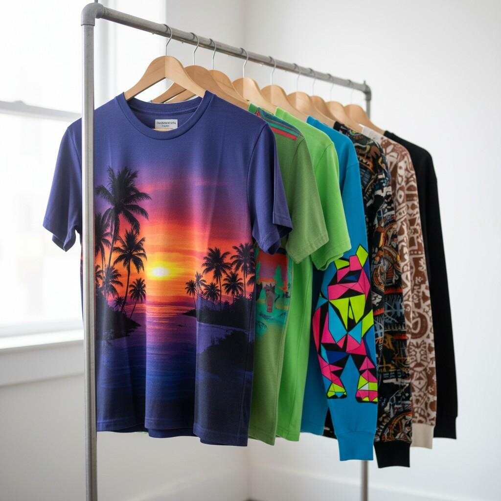
Understanding Fabric Types and Their Impact on Color
Fabric choice is one of the most overlooked yet critical factors in DTG color accuracy. Different textiles interact with ink differently, affecting saturation, sharpness, and longevity.
Cotton
Cotton is the gold standard for DTG printing. It absorbs water-based inks well and produces vibrant, consistent results. Ringspun cotton and combed cotton typically offer smoother surfaces, resulting in sharper prints.
Polyester
Polyester fabrics pose challenges because dyes in polyester can migrate into the ink during curing, causing color shifts (especially with whites and light colors). Specialized inks and lower curing temperatures can mitigate this, but results are often less vibrant than cotton.
Blends
Cotton-poly blends offer moderate performance. Higher cotton content generally yields better color accuracy. However, blends can introduce unpredictable results due to varying absorption rates.
Fabric Color
Garment color dramatically affects print appearance. On light fabrics, inks are printed directly onto the garment. On dark fabrics, a white underbase is required, which alters how colors appear. Designs intended for light shirts may need adjustments for dark garments to maintain vibrancy and contrast.
Understanding how different fabrics influence ink behavior allows designers to make informed choices about colors, saturation, and artwork structure.
Preparing Artwork for DTG Printing
Artwork preparation is where most color accuracy issues originate. Even with excellent equipment, poor file setup can result in dull prints, color shifts, or unexpected output.
Resolution and File Size
DTG printing benefits from high-resolution artwork, typically at least 300 DPI at the final print size. Low-resolution images may appear pixelated or blurry, while oversized files unnecessarily increase processing time without improving quality.
File Formats
Preferred file formats for DTG printing include:
PNG – Supports transparency and is ideal for most DTG workflows.
TIFF – High-quality format suitable for complex designs.
PSD – Useful when layers need to be preserved during design.
Avoid compressed formats such as JPEG for final production files, as compression artifacts can affect print clarity.
Transparency and Backgrounds
When designing for garments, especially colored fabrics, transparent backgrounds are often preferred. This allows the garment color to show through areas where no ink is printed. Use alpha transparency rather than white backgrounds unless specifically required.
Vector vs Raster Graphics
DTG printing works best with raster artwork because inkjet printers interpret pixel-based images naturally. However, vector artwork can be rasterized at high resolution before printing to maintain sharp edges and smooth gradients.
For logos and typography, start with vector files and export them at 300 DPI in RGB format to preserve clarity.
Color Choices and Design Considerations for DTG
Designing for DTG is not the same as designing for screens or offset printing. Certain color strategies yield better results on fabric.
Avoid Over-Saturation
Highly saturated colors that look vibrant on screen may print darker or muddier on fabric. Slightly reducing saturation and increasing brightness during design can result in more balanced prints.
Mind Subtle Gradients
DTG printers handle gradients well, but very subtle gradients may be lost on textured fabrics. Increase contrast slightly to preserve transitions.
Watch Out for Pure Black
Pure RGB black (0,0,0) can sometimes appear washed out on fabric. Using rich black values (such as 30,30,30) can improve depth without oversaturating.
Use Color Contrast Strategically
High contrast between text and background improves readability and visual impact. This is especially important on textured fabrics where fine details can be lost.
Test for Skin Tones
Photographic designs featuring skin tones require special attention. Slight shifts can make faces look unnatural. Proof prints are essential for such artwork.
Thoughtful color selection and design adaptation significantly improve DTG print quality and customer satisfaction.
The Importance of White Ink Underbase
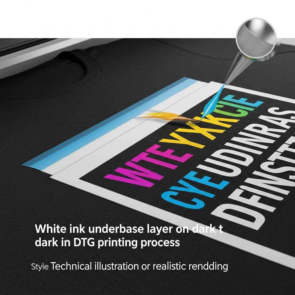 White ink is one of the defining features of DTG printing, especially for dark garments. However, how white ink is applied directly impacts color accuracy and vibrancy.
What Is White Underbase?
On dark garments, DTG printers lay down a layer of white ink beneath the colored inks. This prevents garment color from showing through and dulling the design.
Underbase Thickness and Color Output
Too Thin: Colors appear muted and transparent.
Too Thick: Prints feel heavy, stiff, and may crack over time.
The ideal underbase balances opacity with softness. Many RIP software solutions allow customization of white ink density based on garment color and design needs.
Knockout and Choke Settings
Knockout: Prevents overlapping ink layers, improving sharpness.
Choke: Slightly shrinks the white underbase beneath colored layers to prevent white halos around edges.
Proper configuration of these settings enhances edge definition and overall color quality.
Using RIP Software for Accurate Color Output
Raster Image Processor (RIP) software is the engine that translates your digital artwork into printer-readable data. It manages color conversion, white ink layers, and print optimization.
Key Functions of RIP Software
Color Management and ICC Profile Application
White Ink Generation and Control
Image Scaling and Placement
Ink Usage Optimization
Print Queue Management
Popular DTG RIP solutions include proprietary printer software and third-party options. Regardless of the platform, understanding how your RIP software handles color is essential for consistency.
Using ICC Profiles
ICC profiles define how colors are converted from your design file to printed output on a specific printer, ink set, and fabric type. Always use the correct ICC profile for your garment and ink combination.
If available, create custom ICC profiles using profiling tools and test charts for maximum accuracy.
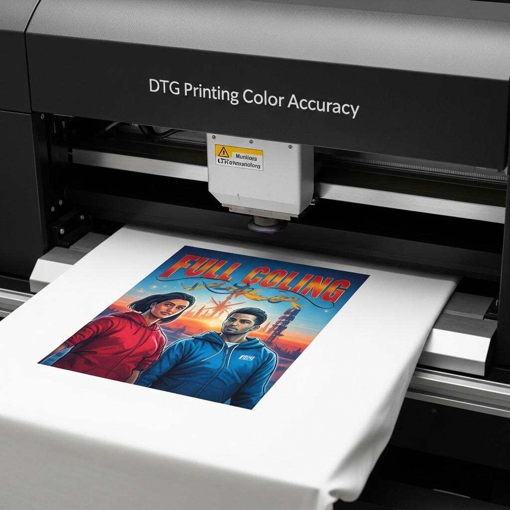
Proof Printing: The Key to Color Confidence
No matter how well you manage color digitally, nothing replaces a physical proof. Proof printing is the most reliable way to verify color accuracy before full production.
Why Proof Printing Matters
Detects color shifts and saturation issues.
Identifies problems with fabric absorption or pre-treatment.
Allows clients to approve physical samples, reducing disputes.
Improves long-term consistency through visual benchmarks.
How to Conduct Effective Proofs
Print your design on the exact garment type and color intended for production.
Cure the print fully before evaluating color.
Compare the printed output to your on-screen design under neutral lighting.
Make necessary adjustments to artwork or RIP settings and reprint if needed.
Establishing a proofing routine reduces costly errors and builds customer confidence in your services.
Lighting Conditions and Color Evaluation
Color perception changes depending on lighting conditions. A design that looks perfect under warm indoor lighting may appear different under daylight or fluorescent light.
Best Practices for Color Evaluation
Use neutral, daylight-balanced lighting when assessing prints.
Avoid evaluating color under colored or overly warm light sources.
Standardize lighting conditions in your workspace for consistent results.
Accurate evaluation ensures that your prints meet expectations across different environments.
Managing Color Consistency Across Batches
Consistency is critical in professional DTG printing. Customers expect reorders to match previous prints exactly.
Factors Affecting Consistency
Ink batch variations
Fabric supplier differences
Changes in humidity and temperature
Printer maintenance and calibration
Variations in pre-treatment and curing
How to Improve Repeatability
Document print settings, RIP configurations, and garment types for each job.
Maintain equipment regularly.
Store inks and pre-treatment chemicals under recommended conditions.
Standardize garment sourcing whenever possible.
Consistency transforms DTG printing from a trial-and-error process into a predictable, scalable operation.
Common DTG Color Problems and How to Fix Them
Even experienced operators encounter color issues. Understanding common problems and their solutions can save time and resources.
Colors Look Dull or Muted
Causes:
Insufficient white underbase
Low ink density settings
Fabric absorbing too much ink
Solutions:
Increase white ink density
Adjust color curves in RIP software
Test on higher-quality garments
Prints Appear Too Dark
Causes:
Excessive ink saturation
Monitor brightness too high
Improper color profiles
Solutions:
Reduce saturation slightly in artwork
Recalibrate monitor
Verify ICC profiles
Color Shifts Between Prints
Causes:
Inconsistent pre-treatment
Environmental changes
Printer maintenance issues
Solutions:
Standardize pre-treatment application
Control humidity and temperature
Perform routine printer calibration
White Halos Around Edges
Causes:
Incorrect choke or knockout settings
Misaligned print passes
Solutions:
Adjust white ink choke settings
Perform printer alignment procedures
Troubleshooting becomes easier when you understand the technical and environmental factors behind each issue.
Designing for Light vs Dark Garments
Artwork preparation differs depending on whether you’re printing on light or dark fabrics.
Light Garments
No white underbase required.
Colors print directly onto fabric.
Artwork can include subtle gradients and lighter tones more easily.
Lower ink usage results in softer hand feel.
Dark Garments
White underbase is essential.
Colors appear slightly different due to the white layer beneath.
Designs may require increased contrast and saturation.
Ink usage is higher, and hand feel may be heavier.
Designing with garment color in mind ensures that the final product matches expectations regardless of fabric shade.
Best Practices for Branding and Logo Reproduction
Logos and branded artwork demand exceptional color accuracy. Even slight deviations from brand colors can weaken identity and professionalism.
Use Official Brand Color Codes
Whenever possible, work with official RGB or HEX color codes provided by the brand. Avoid guessing or sampling from low-quality images.
Create Brand-Specific Profiles
If you frequently print for specific clients, develop customized RIP profiles and artwork presets optimized for their brand colors and garment types.
Keep Reference Prints
Maintain physical samples of approved prints for future comparison and quality control. These references help ensure consistency across reorders and production batches.
The Impact of Pre-Treatment on Color Accuracy
Pre-treatment chemicals prepare fabric to receive ink, particularly white ink on dark garments. However, pre-treatment quality directly affects color output.
Common Pre-Treatment Issues
Over-Application: Leads to discoloration, staining, or uneven ink adhesion.
Under-Application: Results in poor white ink opacity and dull colors.
Uneven Application: Causes blotchy prints and inconsistent color density.
Best Practices for Pre-Treatment
Use consistent spray patterns or automated machines.
Follow manufacturer guidelines for dilution ratios.
Allow garments to dry completely before printing.
Store chemicals properly and monitor expiration dates.
High-quality pre-treatment is the foundation of vibrant and durable DTG prints.
Curing and Its Effect on Final Color
Curing sets the ink into the fabric, making it wash-resistant and durable. Improper curing can distort color and compromise print longevity.
Under-Curing
Colors may appear dull or washed out.
Ink may crack or fade after washing.
Over-Curing
Colors may darken or scorch.
Fabric can stiffen or discolor.
Best Practices
Follow ink manufacturer temperature and time guidelines.
Use heat presses or tunnel dryers with consistent output.
Test wash durability regularly to confirm curing effectiveness.
Consistent curing preserves both color accuracy and print durability.
Advanced Color Optimization Techniques
For professionals seeking maximum control over DTG output, advanced techniques can further refine color accuracy.
Custom ICC Profiling
Creating custom ICC profiles using color calibration charts and spectrophotometers allows you to tailor color conversion precisely to your printer, ink set, and fabric. This significantly improves accuracy, especially for brand colors and photographic designs.
Spot Color Simulation
Some RIP software supports spot color replacement or simulation. This allows you to target specific colors in your design and map them to optimized ink values for more predictable output.
Soft Proofing
Soft proofing simulates print output on screen using ICC profiles. This allows designers to preview how colors will appear on fabric before printing, reducing trial-and-error.
Color Curve Adjustments
Fine-tuning color curves for specific garments or design types can compensate for fabric absorption, underbase behavior, and ink density variations.
While these techniques require additional investment and expertise, they deliver superior consistency and professional-grade results.
Building a Reliable DTG Color Workflow
Consistency and accuracy come from standardized processes, not guesswork. A reliable DTG color workflow ensures predictable results across projects and operators.
Step 1: Calibrate Equipment
Calibrate monitors regularly.
Maintain printers and ensure alignment.
Verify curing equipment temperatures.
Step 2: Standardize File Preparation
Use RGB color space.
Maintain 300 DPI resolution.
Save files in consistent formats (PNG, TIFF).
Step 3: Apply Correct ICC Profiles
Use garment- and ink-specific profiles.
Update profiles when materials change.
Step 4: Proof and Document
Produce physical proofs for approval.
Record settings and garment details for repeat jobs.
Step 5: Evaluate and Refine
Review finished prints under consistent lighting.
Adjust workflows based on feedback and performance data.
A structured workflow minimizes errors, saves time, and enhances overall print quality.
The Business Benefits of Accurate Color Reproduction
While color accuracy is often viewed as a technical issue, it has profound business implications.
Increased Customer Loyalty
Customers who receive consistent, high-quality prints are more likely to reorder and recommend your services.
Reduced Production Costs
Fewer reprints mean less wasted ink, garments, and labor, directly improving profit margins.
Stronger Brand Partnerships
Brands and resellers prefer print partners who can deliver consistent color reproduction, especially for logos and marketing apparel.
Competitive Advantage
In a saturated market, print quality and reliability differentiate your business and justify premium pricing.
Investing in color management and artwork preparation is not just a technical improvement—it’s a strategic business decision.
Future Trends in DTG Color Technology
DTG printing continues to evolve, with new technologies promising even greater color accuracy and efficiency.
Expanded Ink Gamuts
New ink formulations and multi-channel printers are expanding color gamuts, allowing for brighter hues and more precise color matching.
AI-Driven Color Correction
Artificial intelligence is increasingly being used in RIP software to optimize color conversion, white underbase generation, and ink usage automatically.
Improved Fabric Compatibility
Advancements in pre-treatment chemistry and ink technology are improving print quality on polyester, blends, and performance fabrics.
Sustainable Inks and Processes
Eco-friendly inks and reduced waste workflows are becoming more common, offering high-quality color reproduction with lower environmental impact.
Staying informed about these trends ensures that your DTG operations remain competitive and future-ready.
Conclusion
Designing artwork for DTG printing with accurate color reproduction is both an art and a science. It requires understanding how digital color works, how fabric and ink interact, and how printers interpret design data. From selecting the right color space and calibrating your monitor to optimizing white underbase settings and performing proof prints, every step of the workflow influences the final result.
By mastering color management principles, choosing appropriate fabrics, preparing high-quality artwork, and implementing a structured production process, you can achieve consistent, vibrant, and professional DTG prints. Accurate color reproduction not only enhances visual appeal but also strengthens brand identity, reduces production waste, and builds long-term customer trust.Explore our high-quality DTG printers here
Whether you are a designer creating artwork for print, a business owner running a DTG operation, or a marketer seeking consistent branded apparel, the strategies outlined in this guide will help you elevate your results. With the right tools, knowledge, and attention to detail, DTG printing becomes a powerful medium for bringing your designs to life—exactly as you envisioned them.
Frequently Asked Questions (FAQ)
1. Why is accurate color reproduction important in DTG printing?
Accurate color reproduction ensures that printed garments match the original design intent, maintains brand consistency, reduces customer complaints, and minimizes costly reprints.
2. Should I design DTG artwork in RGB or CMYK?
RGB is generally recommended for DTG printing because it offers a wider color gamut and is better supported by DTG RIP software.
3. How can I make sure the colors on my screen match the printed result?
Use a calibrated monitor, work with correct ICC profiles, perform proof prints, and evaluate prints under consistent lighting conditions.
4. Why do colors look different on dark garments compared to light ones?
Dark garments require a white ink underbase, which changes how colors appear and can slightly alter brightness, contrast, and saturation.
5. What fabric works best for DTG color accuracy?
100% cotton garments typically provide the best color vibrancy and consistency. Polyester and blends can introduce challenges like ink migration and reduced saturation.
6. How often should I calibrate my monitor for DTG design work?
Ideally, calibrate your monitor once a month or whenever you notice color inconsistencies.
7. Can DTG printing match exact brand colors?
While DTG can achieve very close matches, exact spot color matching is challenging due to fabric absorption and ink limitations. Custom ICC profiles and proofing help achieve the best possible accuracy.
8. Why do my prints sometimes look dull or washed out?
Common causes include insufficient white underbase, low ink density settings, poor pre-treatment, or fabric absorption issues.
9. Is proof printing really necessary for every job?
While not always required for repeat jobs with known settings, proof printing is highly recommended for new designs, garments, or clients to ensure color accuracy and approval.
10. How can I improve consistency across multiple print runs?
Standardize your workflow, document settings, maintain equipment, use consistent garments, and regularly test and calibrate your system.