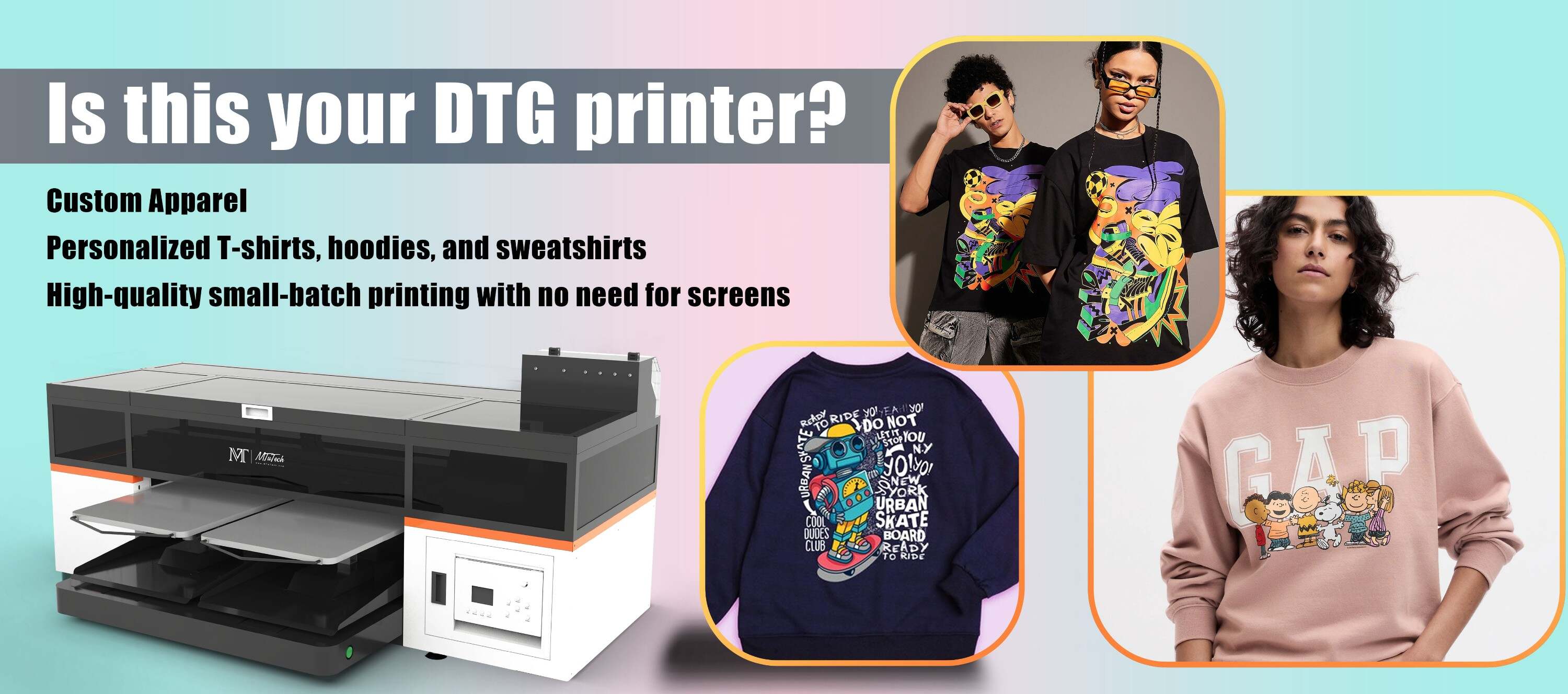
Introduction
In today's world, direct-to-garment (DTG) printing has become a prevalent method in the high-quality printing industry. This strategy has opened new opportunities for print professionals; however, preparing artwork for DTG still elicits its share of challenges. Understanding how to prepare graphics correctly can eliminate many potential issues and ensure that the end products are of the highest quality. Here are some of the common mistakes to avoid when preparing DTG artwork.
Choosing the Wrong Color Profiles
Whether you are a professional artist or a novice graphic designer, color profiles have a significant influence on your DTG project. However, one of the common mistakes is choosing the wrong color profiles.
RGB versus CMYK
In the world of DTG printing, color profiles matter. The two common color profiles are RGB (red, green, blue) and CMYK (cyan, magenta, yellow, and black). RGB is typically used for digital displays, while CMYK is mostly used for printing. It's therefore crucial to convert your artwork to the appropriate color profile to deliver accurate print colors.
Overlooking Resolution and Image Size
Resolution is a common problem when it comes to DTG artwork preparation. When the resolution is low, the printed image quality suffers. Similarly, the size of the image should not be neglected.
The Importance of the Right Resolution
The rule of thumb is to work with a higher resolution than what the final product will need, ensuring enough detail and precision in your designs. 300 DPI (dots per inch) or higher is recommended.
Image Size Considerations
Designs should fit comfortably within the printable area of the garment, so proper scaling and dimensioning are necessary. Also, remember that larger designs may require more ink, increasing the cost of production.
Ignoring the Garment Color
Not every design works on every garment color. The contrast and compatibility between the design and the garment color can play a significant role in your final product.
Avoiding White Highlights on Light Garments
Using white highlights in your design for light-colored shirts is a common mistake. If you're printing on a white or pale garment, consider whether your design would benefit from colored highlights instead.
Negative Images on Dark Garments
If you're printing on a darker garment, some parts of the design might need to be adjusted to appear correctly when printed. Consider using the negative (inverted colors) version of the design image, enhancing the final result.
Conclusion
Preparing artwork for DTG printing doesn't need to be daunting. Avoiding these common errors can dramatically improve the quality of your final products. And leaning on the right technology like using high-quality DTG printers can do wonders for your printing business, helping to ensure precision and vividness in every print.
FAQ Section
Why should resolution matter in DTG printing?
Resolution matters because it significantly impacts the quality of your print. The higher the resolution, the more detail is captured in your image, resulting in crisp, clear, and precise prints.
Can I use both RGB and CMYK color profiles in my DTG printing?
While both RGB and CMYK color profiles can technically be used in DTG printing, CMYK is generally preferred for this type of printing. The RGB profile is more suitable for digital displays rather than physical prints.
What's the advantage of using high-quality DTG printers?
High-quality DTG printers can provide precise, vivid, and high-resolution prints. These printers are engineered for efficiency and consistency, delivering exceptional print results every time.